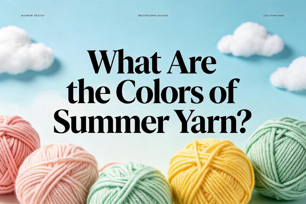
The Ultimate Guide to Summer Yarn Colors: Palettes, Trends, and Strategic Selection
Table of Contents
- Introduction: The Power of Color in Seasonal Textile Planning
- Understanding the Summer Color Palette: Core Principles
- Global Color Authority: Pantone’s Summer Influences and Direction
- Natural & Classic Summer Color Families
- 4.1. Whites, Cottons, and Linens: The Foundation of Coolness
- 4.2. Sky and Sea Blues: Tranquility and Depth
- 4.3. Sun-Kissed Yellows and Warm Neutrals: Optimism and Light
- 4.4. Earthy Greens and Botanicals: Freshness and Vitality
- Fashion-Forward and Trending Summer Hues
- 5.1. Vibrant Brights and Citrus Accents: High-Energy Highlights
- 5.2. Sunset and Warm Spice Tones: Bohemian Flair
- 5.3. Iced Pastels and Frosted Neutrals: Modern Minimalism
- The Science of Color in Yarn: Dye Types and Fiber Interaction
- 6.1. Achieving Vibrancy vs. Softness on Different Fibers
- 6.2. Colorfastness Considerations for Summer (Sun, Chlorine, Water)
- Color Selection by End-Use: A Strategic Approach
- 7.1. Apparel Yarns: From Activewear to Resort Wear
- 7.2. Home Textile Yarns: Curtains, Upholstery, and Linens
- 7.3. Beachwear and Swimwear Yarns: Technical Demands
- 7.4. Yarns for Accessories, Toys, and Crafts
- Building Commercial Yarn Collections: Color Ratios and Depth Planning
- 8.1. The 70-20-10 Rule for Balanced Collections
- 8.2. Planning Basics, Fashion Colors, and Statement Accents
- Critical Technical Considerations for Manufacturers
- 9.1. Color Matching and Consistency Across Batches
- 9.2. Impact of Yarn Color on Fabric Construction and Dyeing
- 9.3. Cost Implications of Complex vs. Simple Dyes
- Marketing and Consumer Psychology: What Summer Colors Communicate
- Forecasting and Sourcing: Timing Your Yarn Color Procurement
- Sustainability and Color: The Rise of Low-Impact Dyes and Naturals
- Data-Driven Appendix: Seasonal Color Reference Tables
- Frequently Asked Questions (FAQ)
- Conclusion: Mastering Summer Color for Market Success
1. Introduction: The Power of Color in Seasonal Textile Planning
For textile professionals, color is far more than aesthetics; it is a strategic business decision that drives sales, defines brand identity, and connects with consumer emotion. This is especially true for summer—a season associated with light, energy, travel, and leisure. The right summer yarn colors can make the difference between a best-selling collection and stagnant inventory.
This comprehensive guide moves beyond subjective trends to provide a data-informed, commercially savvy analysis of summer yarn colors. Whether you are developing a line of breezy linens, vibrant activewear, coastal-inspired home textiles, or cheerful plush toys, understanding the palette, its applications, and its technical execution is essential for success.
2. Understanding the Summer Color Palette: Core Principles
Summer colors are psychologically and functionally linked to the season’s characteristics:
- Lightness & Brightness: Reflecting intense sunlight, colors tend to be higher in value (lighter) or maximum in chroma (brightest).
- Cool Undertones: To evoke feelings of coolness and refreshment, even warm colors often have blue or green undertones (e.g., a citrus yellow with a green base).
- Nature-Inspired: Direct references to sky, sea, sand, foliage, and summer flora.
- Clarity: Colors are clean and clear, avoiding muted, grayish tones typical of fall.
3. Global Color Authority: Pantone’s Summer Influences
Organizations like the Pantone Color Institute™ release seasonal palettes that profoundly influence global design. Recent summer palettes have emphasized:
- A Nostalgic Optimism: Reimagined classic brights.
- Digital Lavender & Tranquil Blues: Colors reflecting calm and virtual escapism.
- Sustained Earth Tones: Connecting to nature and sustainability.
While not prescriptive, these palettes are vital for brands aiming at the fashion-forward segment.
4. Natural & Classic Summer Color Families
4.1. Whites, Cottons, and Linens
The absolute cornerstone of summer.
- Key Shades: Pure optical white, soft ivory, ecru, oatmeal, natural flax.
- Function: Creates a sense of space, cleanliness, and reflects heat. Essential for base layers, shirts, and bedding.
- Technical Note: Achieving a consistent, bright white on cotton or linen requires excellent scouring and possibly bleaching.
4.2. Sky and Sea Blues
Symbolize tranquility, depth, and openness.
- Key Shades: Powder blue, sky blue, cerulean, aqua, turquoise, navy (as a classic anchor).
- Function: Universally flattering and calming. Ranges from pale, ethereal tones to deep, resonant nautical shades.
- Data Point: Blue is consistently ranked the world’s favorite color, making it a commercial safe bet.
4.3. Sun-Kissed Yellows and Warm Neutrals
Evoke sunshine, warmth, and optimism.
- Key Shades: Lemon chiffon, buttercup, maize, golden sand, camel, terracotta.
- Function: Adds energy and light. Softer yellows and warm beiges are sophisticated and wearable.
4.4. Earthy Greens and Botanicals
Represent growth, freshness, and the natural world.
- Key Shades: Sage, seafoam green, eucalyptus, palm leaf, olive drab.
- Function: Provides a cooling, organic counterpoint. Sage and eucalyptus have been major trends in home and apparel.
Table 1: Classic Summer Color Families & Applications
| Color Family | Core Shades (Examples) | Primary Fiber Associations | Ideal End-Use Examples |
|---|---|---|---|
| Whites & Neutrals | Optical White, Ivory, Oatmeal | Cotton, Linen, Viscose, Bamboo | T-shirts, bed linens, towels, lightweight sweaters |
| Blues | Powder Blue, Cerulean, Aqua, Navy | Cotton, Linen, Polyester, Nylon | Denim, shirts, swimwear, nautical stripes, beach towels |
| Yellows/Warm Neutrals | Buttercup, Maize, Sand, Terracotta | Cotton, Linen, Silk blends | Sundresses, resort wear, casual knitwear, upholstery |
| Greens | Sage, Seafoam, Eucalyptus, Olive | Cotton, Linen, Hemp, Tencel™ | Activewear, casual separates, curtain sheers, table linens |
5. Fashion-Forward and Trending Summer Hues
5.1. Vibrant Brights and Citrus Accents
- Colors: Zesty lime, electric orange, fuchsia pink, hot coral.
- Role: Used as accents or in bold, all-over patterns for maximalist style. Dominant in performance activewear and youth-oriented fashion.
5.2. Sunset and Warm Spice Tones
- Colors: Peach sorbet, burnt orange, dusty pink, warm lavender.
- Role: Creates a bohemian, relaxed, and sunset-inspired mood. Excellent for flowing dresses, kaftans, and home decor accents.
5.3. Iced Pastels and Frosted Neutrals
- Colors: Iced lavender, mint frost, barely-there blue, frosted almond.
- Role: A modern, minimalist take on summer. Feels elevated, cool, and sophisticated. Key for contemporary loungewear and home textiles.
6. The Science of Color in Yarn
- Fiber Dictates Process: Cotton/linen use reactive or direct dyes. Wool uses acid dyes. Synthetics (polyester) use disperse dyes. The same Pantone color will require different dye formulations for different fibers.
- Achieving Vibrancy: Synthetic fibers (polyester, nylon) often yield the most brilliant, saturated colors. For natural fibers, mercerized cotton or high-quality combed cotton provides a better base for vibrant dyes.
- Colorfastness is Critical: Summer products face sun (lightfastness), sweat (perspiration fastness), chlorine (for swimwear), and water (washfastness). Specify and test for these. Poor lightfastness turns a bright yellow to dull beige.
7. Color Selection by End-Use: A Strategic Approach
7.1. Apparel Yarns:
- Activewear: High-energy brights (citrus, electric blue), high-visibility neons, and sophisticated dark tones (black, deep navy) for performance.
- Resort Wear & Everyday Summer: Dominated by whites, blues, stripes (navy/white, red/white), botanicals, and warm neutrals.
- Consideration: Skin tone compatibility drives volume sales. Blues, clean whites, and certain greens have the broadest appeal.
7.2. Home Textile Yarns:
- Bed Linens & Towels: Whites, ivories, and spa-like tones (seafoam, powder blue, sage) dominate for their calming, clean appearance.
- Indoor/Outdoor Upholstery: Must consider UV resistance. Sun-faded colors are a major failure. Solution-dyed acrylic or olefin are excellent for fade resistance in brighter summer hues.
7.3. Beachwear and Swimwear Yarns:
- Technical Non-Negotiables: Exceptional chlorine fastness (for pool) and saltwater/sunfastness (for ocean). Colors often lean toward vibrant brights, nautical themes, and tropical prints.
- Fiber: Primarily nylon and polyester for durability and color retention.
7.4. Yarns for Accessories, Toys, and Crafts:
- Plush Toys: Summer releases feature bright, cheerful colors (yellows, pinks, aquas) for beach-themed toys, animals, and characters.
- Craft Yarns: The season drives demand for cottons and linens in the full spectrum of summer colors for handmade garments and home projects.
Table 2: Color Priority & Fastness Requirements by End-Use
| End-Use | Top Color Priorities | Critical Fastness Tests | Recommended Fiber Types for Color |
|---|---|---|---|
| Swimwear | Vibrancy, Trend Relevance | Chlorine, Light, Wash | Nylon, Polyester (Solution-Dyed best) |
| Premium Bed Linens | Calming Hues, Purity of White | Wash, Light (for colored trims) | Long-Staple Cotton, Linen, Bamboo |
| Summer Knitwear | Softness, Wearability, Fashion | Wash, Light, Perspiration | Cotton, Cotton Blend, Mercerized Cotton |
| Outdoor Cushions | Fade Resistance, Brights/Whites | Lightfastness (Xenon Arc) | Solution-Dyed Acrylic, Olefin, Polyester |
| Plush Toys | Cheerful Brights, Safety | Saliva & Perspiration, Wash (for safety) | Acrylic, Polyester |
8. Building Commercial Yarn Collections: The 70-20-10 Rule
A balanced commercial yarn line for summer might follow this ratio:
- 70% Core Classics: White, Navy, Sky Blue, Natural, Khaki, Black (yes, black sells year-round). Your bread and butter.
- 20% Seasonal Fashion Colors: This year’s featured pastels, botanicals, or brights (e.g., Pantone’s Color of the Year influence).
- 10% Statement/Accent Colors: Bold, trendy accents like hot coral or lime for risk-taking designers or small batch production.
9. Critical Technical Considerations for Manufacturers
- Batch-to-Batch Consistency: Crucial for large orders. Use spectrophotometers and enforce a tight Delta-E tolerance (e.g., dEcmc < 1.0 under D65 light).
- Color and Fabric Construction: A jersey knit will look different from a woven poplin in the same dyed yarn due to light reflection. Always approve colors on the final fabric structure.
- Cost: Complex colors (certain bright reds, deep blacks) or colors requiring multiple dye steps are more expensive. Natural, undyed yarns have a cost advantage but limit the palette.
10. Marketing and Consumer Psychology
- Blue & Green: Communicate trust, calm, reliability—ideal for broad-market apparel and home goods.
- Yellow & Orange: Communicate energy, fun, optimism—perfect for children’s wear, activewear, and accent products.
- White: Communicates purity, simplicity, and luxury—key for premium segments.
11. Forecasting and Sourcing Timeline
- Designers forecast colors 12-18 months ahead of the retail season.
- Yarn manufacturers and mills need to procure dyes and plan production based on these forecasts 6-12 months ahead.
- Procurement Managers should lock in yarn colors and quantities with suppliers 3-6 months before their production starts.
12. Sustainability and Color
Demand is growing for:
- Low-Impact Dyes: Reducing water and energy use.
- Natural Dyes: For a niche, artisanal market (resulting in softer, often less uniform colors like ochre, indigo, and plant-based greens).
- Pre-Colored Fibers: Solution-dyed fibers (color added during polymer formation) offer superior fastness and reduce water pollution from dyehouses.
13. Data-Driven Appendix: Seasonal Color Reference Tables
Table 3: Suggested Summer Yarn Color Palette for a Balanced Wholesale Collection
| Role in Collection | Color Name | Pantone TPX Approx. | Target End-Uses |
|---|---|---|---|
| Core Basic | Optical White | 11-0601 TPX | All |
| Core Basic | True Navy | 19-3832 TPX | Knit, Woven, Denim |
| Core Basic | Sky Blue | 14-4318 TPX | T-shirts, Babywear, Linens |
| Core Basic | Natural Oatmeal | 12-1007 TPX | Sweaters, Home Textiles |
| Fashion Color | Buttercup Yellow | 13-0858 TPX | Dresses, Activewear Accents |
| Fashion Color | Sage Green | 16-0119 TPX | Apparel, Upholstery Yarn |
| Fashion Color | Peach Sorbet | 15-1530 TPX | Women’s Knitwear, Lingerie |
| Statement Accent | Vibrant Coral | 16-1546 TPX | Swimwear, Trim, Accessories |
| Statement Accent | Lime Punch | 14-0452 TPX | Activewear, Youth Fashion |
14. Frequently Asked Questions (FAQ)
Q1: Is black a summer yarn color?
A1: Yes, commercially it is essential. While not “summery” in feel, black is a year-round core basic for trousers, eveningwear, accessories, and as a contrasting color in prints and stripes. It should always be part of a comprehensive yarn offering.
Q2: We produce plush toys. What summer colors are safest for high volume?
A2: For volume toy production, focus on bright, primary, and secondary colors that are cheerful and gender-neutral: Vibrant Blue, Sunny Yellow, Grass Green, and Hot Pink. These colors are consistently popular for animals, characters, and basic shapes year after year, minimizing risk.
Q3: How do I ensure my light-colored linen yarn doesn’t look yellow or dull?
A3: The base color of the linen fiber is crucial. Specify a high-grade linen with a naturally bright, greyish undertone. The bleaching or optical brightening process must be carefully controlled. Request lab dips and approve them under both daylight (D65) and store lighting (TL84).
Q4: What’s the difference between “summer white” and “winter white” in yarn?
A4: This is more of a fashion concept than a technical yarn specification. Typically, “Summer White” is a brighter, cooler, often optical white. “Winter White” is a slightly warmer, creamier, off-white (like ivory or oyster). In yarn, you would specify the desired tone using a physical standard.
Q5: For a carpet manufacturer, are summer colors relevant?
A5: Absolutely, especially for indoor/outdoor and area rugs. Summer colors for carpets include natural jute and sisal tones, sea-glass blues and greens, and sandy beiges. These colors are popular for seasonal refreshes and in vacation homes. UV stability is paramount.
Q6: Can I get a true, vibrant red on 100% cotton yarn for summer T-shirts?
A6: It is challenging but possible. Cotton lacks the molecular structure to hold some red dyes as brilliantly as polyester. Achieving a vibrant, wash-fast red on cotton often requires a higher dye concentration, a high-quality combed or mercerized base, and potentially a double-dyeing process, which increases cost.
Q7: How important are metallic or iridescent yarns for summer?
A7: They are a specialized niche but important for eveningwear, festival wear, and certain accessories. Think fine metallic gold or silver threads in a knit for sparkle, or iridescent yarns that shift from blue to green. They represent a small percentage of the market but command higher margins.
Q8: We are a small brand. How many summer colors should we start with?
A8: Start focused. Choose 3-4 Core Colors (e.g., White, Navy, a signature blue, a warm neutral) and 2-3 Fashion Colors that tell your brand’s summer story. It’s better to execute a small palette perfectly (with good matching and fastness) than to offer many colors poorly.
15. Conclusion: Mastering Summer Color for Market Success
Selecting summer yarn colors is a multifaceted discipline blending art, science, and commerce. It requires an understanding of timeless human responses to color, fleeting fashion influences, the rigorous demands of textile chemistry, and the practical realities of supply chain timing.
By adopting the strategic framework outlined here—segmenting by end-use, prioritizing fastness, balancing your collection, and planning far ahead—you transform color selection from a guessing game into a competitive advantage. In the vibrant tapestry of the summer market, the right colors don’t just attract the eye; they capture the season’s spirit, fulfill performance promises, and ultimately, drive sustainable profitability.